Middle | Visual Development, Style Guides, Technical Outlines
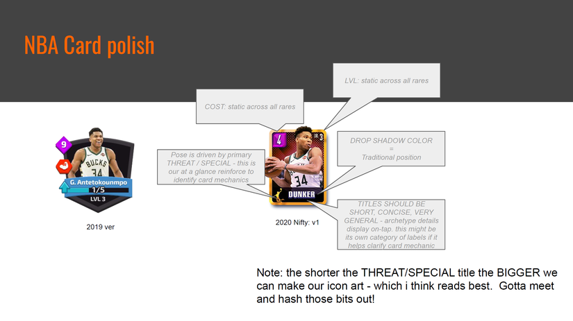
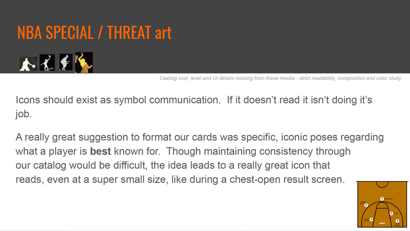
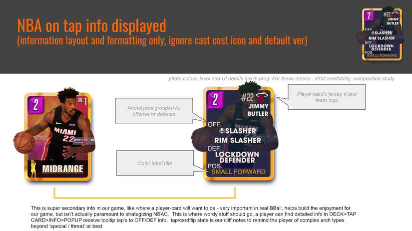
This is when you want to think about what is technically achievable for the project. I think interactive prototypes are ideal when selling a creative idea. A “wow” moment is harder to sell if the team can’t imagine it. Mock-executions (like the example below) are how I like to purpose an engaging experience, but it also shows it’s technically achievable with the existing systems in play. Subtle things, like varied font sizes or color uses, are harder to subconsciously tie together if they aren’t consistent. In some situations, like where you want the user to feel uneasy, this is a great non-verbal way to reinforce that tone without saying a word. We want UI / UX to feel like an extension of the theme/setting it lives on.
Showing visual systems in play helps to relay it’s faster to experiment when working dynamically. In time sensitive situations like a VC based company, time and projecting accurate timetables is very important. Which is why product management skills are essential in visual development. We all love what we do so much, we want to make the very best things possible for the users we want to attract. We also need to consider time & turnaround or it’ll be difficult to deliver on promises.
I made this per-visualization video applying what was technically achievable within Unity.
Requested:
Show team logos
Estimated wait
Cancel button (suggested same position as play button, placed where the action would be intentional)
Tips, adverts, or information benefiting the player
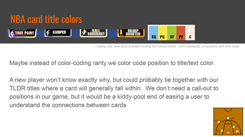
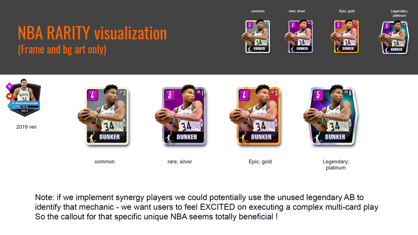
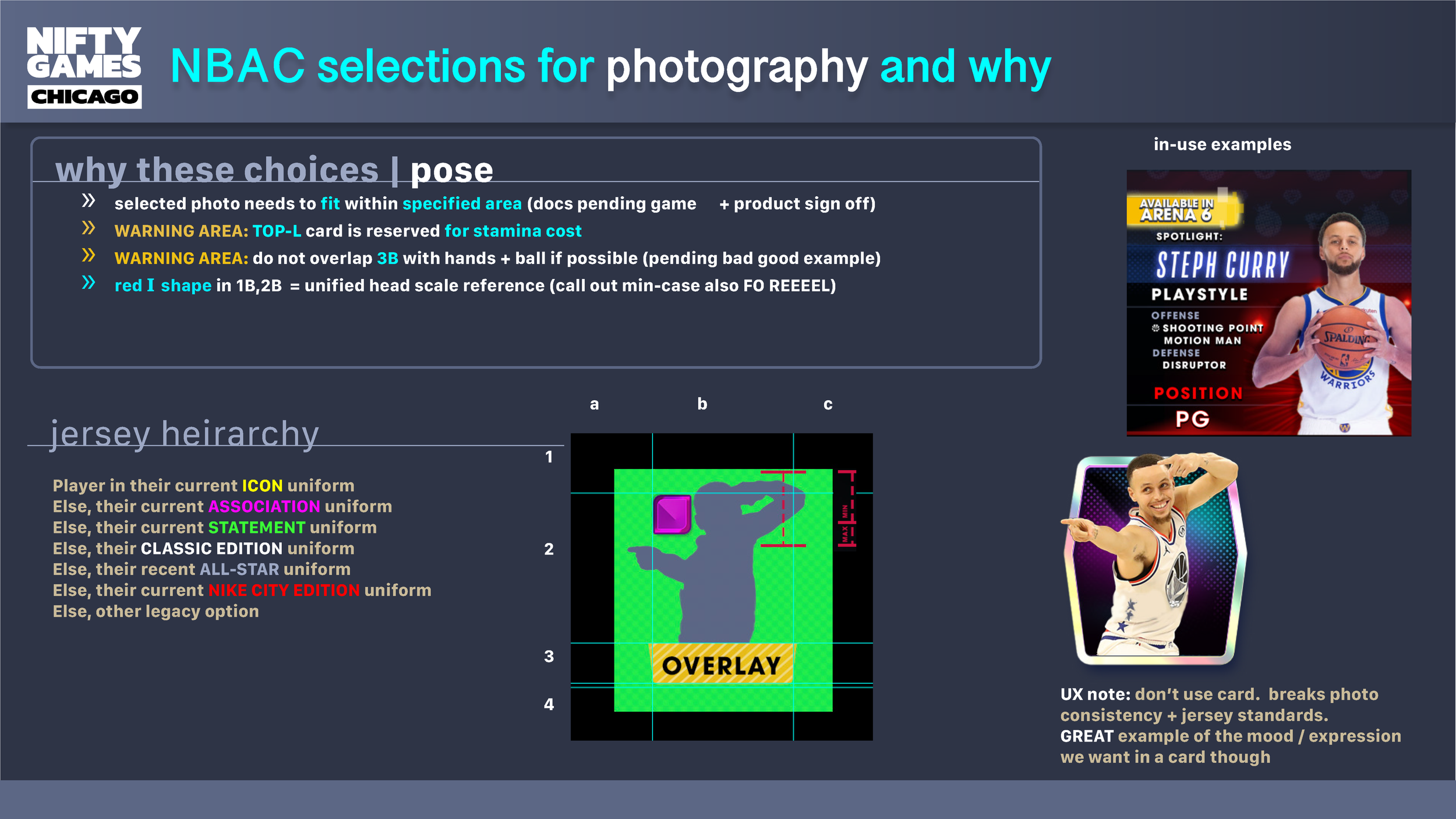
UX Color System: The position Point Guards/PG are red. The tint will be dynamically applied in-engine.
In this next example I needed to make a static screen feel more alive and inviting. I included the individual working parts for clarity. I wanted to use as little as possible to start with (due to talent / time restrictions).
Bonus: this marquee could be unique every stage or for promotions


