Learning the Industry and Their Needs
Additionally, I had a ton of content and information that were grouped as ‘important and will need to be implemented’ but not categorized, prioritized, or even really fleshed out in terms of what they’ll do and where they should go. Things like commodity monitors, holders, historic prices, order management, PL analysis, science, news, pubmed, modules (the type of investing, not the kind that is interchangeable) - about 50 things in total that needed to be grouped, and there needed to be a good way to present them, so those were things that I was continually working out. This project gave me so much freedom to try ideas and discover great new ways to approach and organize.

MOVE ALL THE THINGS
Customization was the largest gap in the competitive products. As an investor, you are constantly checking your investments, watching the quote monitor, checking in with your network of constituents and colleagues, and researching to make solid investments. Why not let the user decide what they want to see and where?

additional concept - pull out menus to be set anywhere in the layout

Work it Harder, Make it Better, Do it Faster, Makes us Stronger
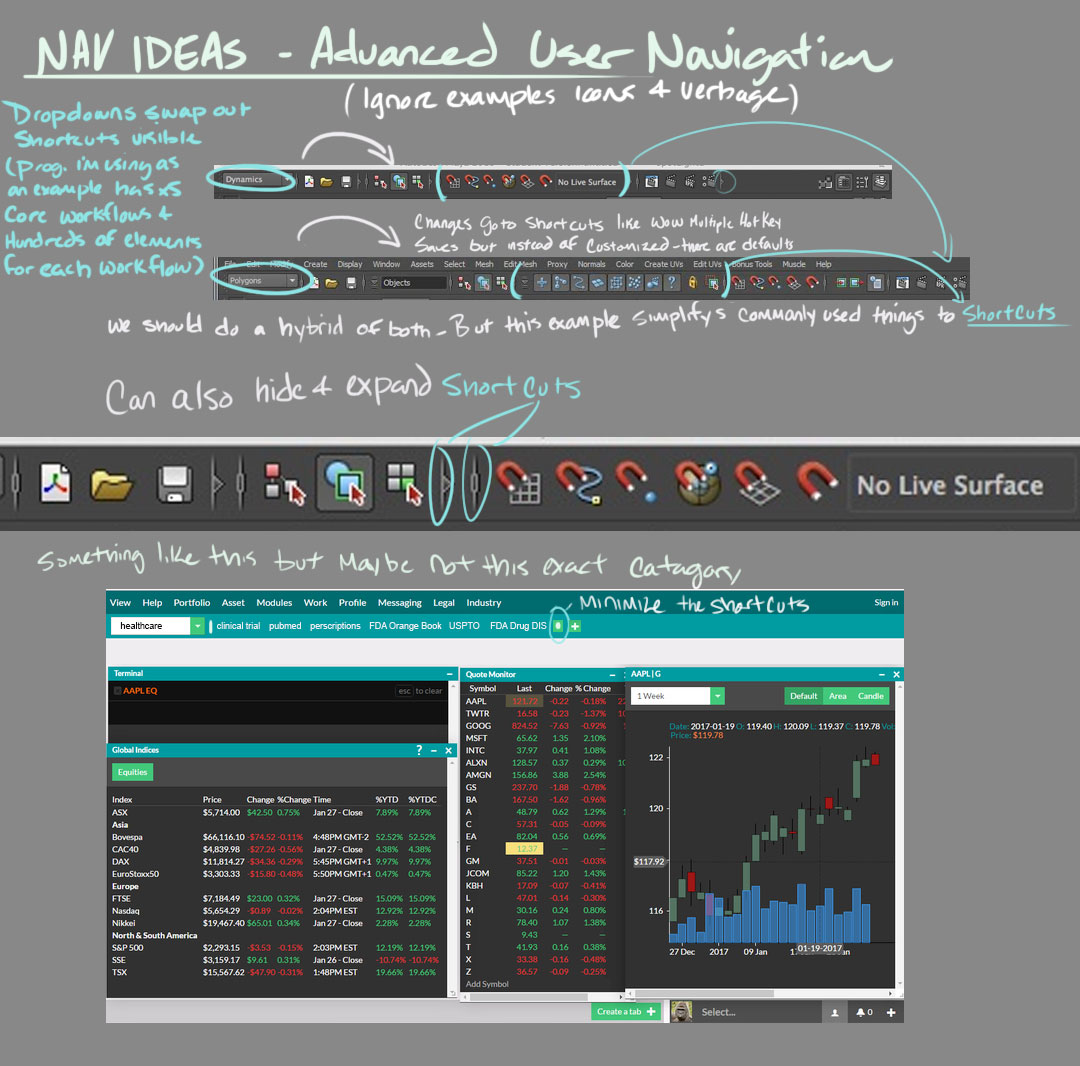
After hearing about the problem, feeling my way around competitors software, and thinking about what a user would want I discussed and meshed out a few fundamental ideas that filled the gap competitors had. Things like windows that can be moved, overlapped, scaled and saved in place. Additional tabs, like browser tabs, that save alternate layouts. Distilled, my goal was to incorporate multiple ways to allow a user to customize how they lay out their own personal investment interface. Bloomberg has a custom keyboard that comes with its terminal, allowing the user quick access to the information available. What they don’t have is a way to use a standard keyboard to achieve the same result, and this lack of familiar tools is a hurdle for the new users we wanted to bring to the product. Much like an MMO-style game, we incorporated both shortcut keys using F1-12, but also hotkeys to pull up and minimize content. The foremost intention is that users find a comfortable way to use the app. Since the product was targeted towards two drastically different groups, I felt it was essential to offer as many options as possible.

workflow concept - find ways to customize and quickly navigate