UI UX and Visual Design

what did we want to do, who needed this

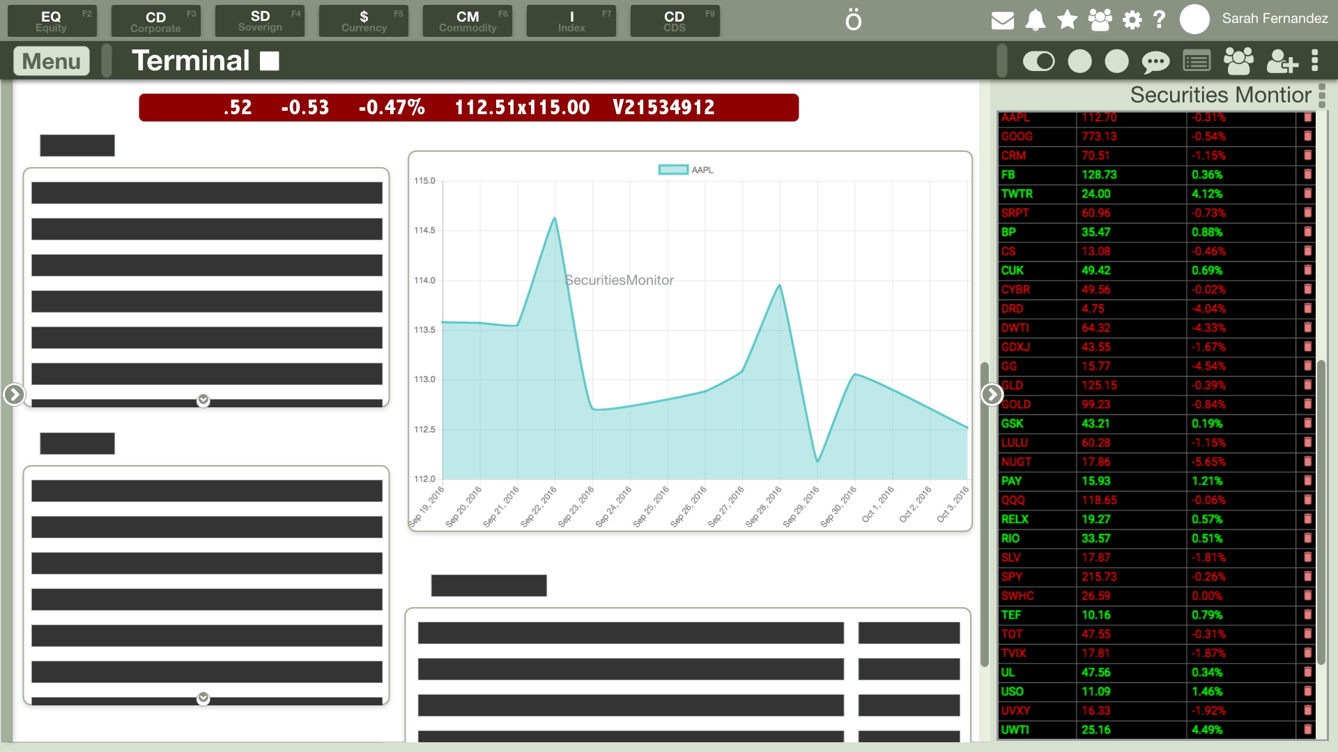
In the beginning there was the Bloomberg Terminal, and it was and remains the Microsoft of the investing world. You either use it, chugging through a very out of date design with no emphasis on UX, or you’re not a serious investor. The learning curve is steep, but the Bloomberg terminal so established that improving upon the design is a near impossible endeavor. What Godel intends to do is offer innovative UX solutions, customization, and other elements to provide a modern alternative that still fits the needs of the serious investor. Godel’s terminal sets itself apart by being completely customizable to suit a diversity of user needs.

working version of the app
working version of the app

Video Demo of working concept

voice over by me, and yes, I’m available for voice work
(not really)


Sketching, Wireframes, A/B approach, and Mockups

I was tasked with coming up with these innovations, bouncing concepts off of the founders to find a great way to marry modern flows, trends, and concepts into the already-established foundation that investors lean on. The Godel founders use Bloomberg daily and were great resources to tap regarding what they do not like about the current standard. I also did a ton of research in order to produce the best concept possible. With their complaints and my experience designing UIUX for the gaming industry, I was able to come up with some really cool ideas that have made it to the current build.

Various stages of concept to screenshots of a working build

Various stages of concept to screenshots of a working build

Challenges Along the Way

One of the largest hurdles to overcome was learning the terminology, the most important elements to investors, and how best to create something that would be easy to pick up and use for both that demographic and people new to the investing world. When designing UX, something I really want to encourage is multiple ways to achieve the same thing. Because our target market included both seasoned veterans and new users, this was a fantastic opportunity to consider two drastically different groups and build something that they’ll both feel is intuitive. Learning the foundations of investing UI was a steep curve in and of itself, but finding ways to appeal to both veterans and new users alike was an exciting challenge to tackle. When I was dong Quality Assurance work as a tester earlier in my career, I learned first-hand how UX can make or break something. One of the most frustrating things that I personally dealt with, and challenged players as well, was doing something that seemed obvious expecting a result and being totally flustered when it didn’t work. When something isn’t clearly defined or explained well, it detracts from the overall experience. This is a big deal for me, and if I’m at the helm steering the overall experience and design, I want this to happen as much as possible. A happy user is a repeat user!

Learning the Industry and Their Needs

Additionally, I had a ton of content and information that were grouped as ‘important and will need to be implemented’ but not categorized, prioritized, or even really fleshed out in terms of what they’ll do and where they should go. Things like commodity monitors, holders, historic prices, order management, PL analysis, science, news, pubmed, modules (the type of investing, not the kind that is interchangeable) - about 50 things in total that needed to be grouped, and there needed to be a good way to present them, so those were things that I was continually working out. This project gave me so much freedom to try ideas and discover great new ways to approach and organize.


navmock2.jpg

MOVE ALL THE THINGS

Customization was the largest gap in the competitive products. As an investor, you are constantly checking your investments, watching the quote monitor, checking in with your network of constituents and colleagues, and researching to make solid investments. Why not let the user decide what they want to see and where?

 
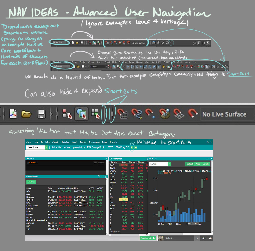
additional concept - pull out menus to be set anywhere in the layout

additional concept - pull out menus to be set anywhere in the layout

nav_menuidea.jpg

Work it Harder, Make it Better, Do it Faster, Makes us Stronger

After hearing about the problem, feeling my way around competitors software, and thinking about what a user would want I discussed and meshed out a few fundamental ideas that filled the gap competitors had. Things like windows that can be moved, overlapped, scaled and saved in place. Additional tabs, like browser tabs, that save alternate layouts. Distilled, my goal was to incorporate multiple ways to allow a user to customize how they lay out their own personal investment interface. Bloomberg has a custom keyboard that comes with its terminal, allowing the user quick access to the information available. What they don’t have is a way to use a standard keyboard to achieve the same result, and this lack of familiar tools is a hurdle for the new users we wanted to bring to the product. Much like an MMO-style game, we incorporated both shortcut keys using F1-12, but also hotkeys to pull up and minimize content. The foremost intention is that users find a comfortable way to use the app. Since the product was targeted towards two drastically different groups, I felt it was essential to offer as many options as possible.

 
workflow concept - find ways to customize and quickly navigate

workflow concept - find ways to customize and quickly navigate


All Together Now

Remote work before it was cool!

You should know I’m a big team player. When everyone is contributing ideas it always yields a great end result. Having worked in small startup settings, large studios, and with 5 years of experience working remotely as a contractor, I’m totally fine with owning a huge portion of a project. I will take the initiative and try to foresee issues and hurdles preemptively in order to work efficiently. This is one of those instances where taking initiative and being vocal beyond a typical “your job is to make this one screen” helped. Since this was an endeavor that was new for all of us, with a team of people who all respect and believe in each other, there’s more “yes, and” and less of that other thing detracts from innovative thinking. My visions were realized with the help of 3 amazingly talented engineers, working closely together to ensure the ideas that I had were able to be implemented before expanding too far along a particular vector. Working remotely utilizing a virtual office with the engineers and two founders, we were able to realize the vision the original founder intended, presented in the very best way possible.

A/B Testing

This was a really interesting project, as the founders knew they had an idea they wanted to push but no idea how they wanted to present it. I had a great deal of control when it came to designing the core layout, presenting various ways to customize layouts, and revising these ideas based on feedback. The original concept held strongest, but I got to try a second take in order to see if I could outdo the fundamentals I was working around. I used this opportunity to expand on my knowledge of interactive mocks.

XD Demo of an alternate layout

This was a rough layout using an alternative concept presented by one of the founders. It mirrored competitors a great deal more, and felt a tad claustrophobic in execution compared to the working build. While we didn’t end up using it, it’s always worth a try to tackle the problem from a different angle!


Epilogue

Not only did I pick up a few tricks, I got to be involved from the ground up in designing and overall look and feel of Godel’s investing software. It’s indescribably satisfying to see an idea become dynamic and actually tangible. This has been one of my favorite projects in recent times.